‘Y’ Does Chicago Have a Secret Symbol?
Published on April 25, 2024
eATLAS’ Hidden in Plain Sight scavenger hunt Adventure asks you to solve clues that will take you to seven locations where Chicago’s Y-shaped municipal device is displayed. The symbol is also featured on our CHIstory ScavHunt Adventure, which takes place May 31st-June 2nd, with a chance to win cash prizes totaling $5,000.
By Dave Lifton (@daveeatschicago)
Chicago’s flag is iconic, a striking representation of its three sides, two bodies of water, and four pivotal moments in the city’s history. But before the flag was created in 1917—and the current incarnation adopted in 1939—Chicago had a different official symbol: a capital ‘Y’ inside a circle called a ‘municipal device’.
In September 1892, as the city prepared for the upcoming World’s Columbian Exposition, the Chicago Tribune announced that the Citizens’ World’s Fair Committee was offering a prize of $100 to create a “municipal color” scheme, similar to European cities and major colleges, to be displayed at the ceremony dedicating the grounds. Three weeks later, the paper revealed the committee’s decision. Of the 829 entries, an architect named A.J. Roewad, who emigrated from Copenhagen because the awarding of the fair to Chicago meant that the rapidly growing city would emerge as the center of the U.S., had won. His design was of a red flag, banner, or shield divided into three parts by white or silver—a representation of the North, South, and West Sides at the convergence of the three branches of the Chicago River at Wolf Point.
The committee chose terra cotta as the ideal shade, and Roewad approved, saying that no other countries were using it. On behalf of the committee, Frank D. Millet, an artist who was helping decorate the fair’s buildings, wrote that it was “ingenious, appropriate, and decorative. It is significant and simple, and recalls a heraldic device, or rather, is reminiscent of the way coats of arms and banners were designed in the days of chivalry. … The colors blend beautifully; they are genial, and they will appear bright against any background. They will deck the city with that gay and joyous air which suits the grand occasion next month.”
Honorable mention went to R.E. Janney for his design of a “phoenix in red flames on a white ground,” a symbol of the city’s recovery from the Great Chicago Fire of 1871.
In 1917, the City Council gave Roewald’s creation the designation of ‘municipal device’, for use on vehicles and for any other purpose as an expression of civic pride. It is defined in the Municipal Code of Chicago as:
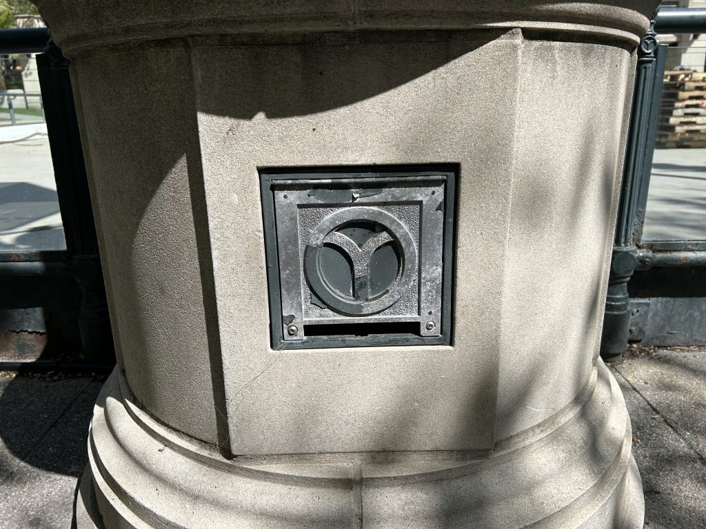
The municipal device, for use by the varied unofficial interests of the city and its people, shall show a Y-shaped figure in a circle, colored and designed to suit individual tastes and needs.
The ability to customize it turned out to be crucial. Rather than being set in stone, like the flag or seal, the look of the municipal device could be manipulated—turned upside-down, widened, slimmed, or colored—in a variety of ways. As a result, it blends into its settings rather than standing out.
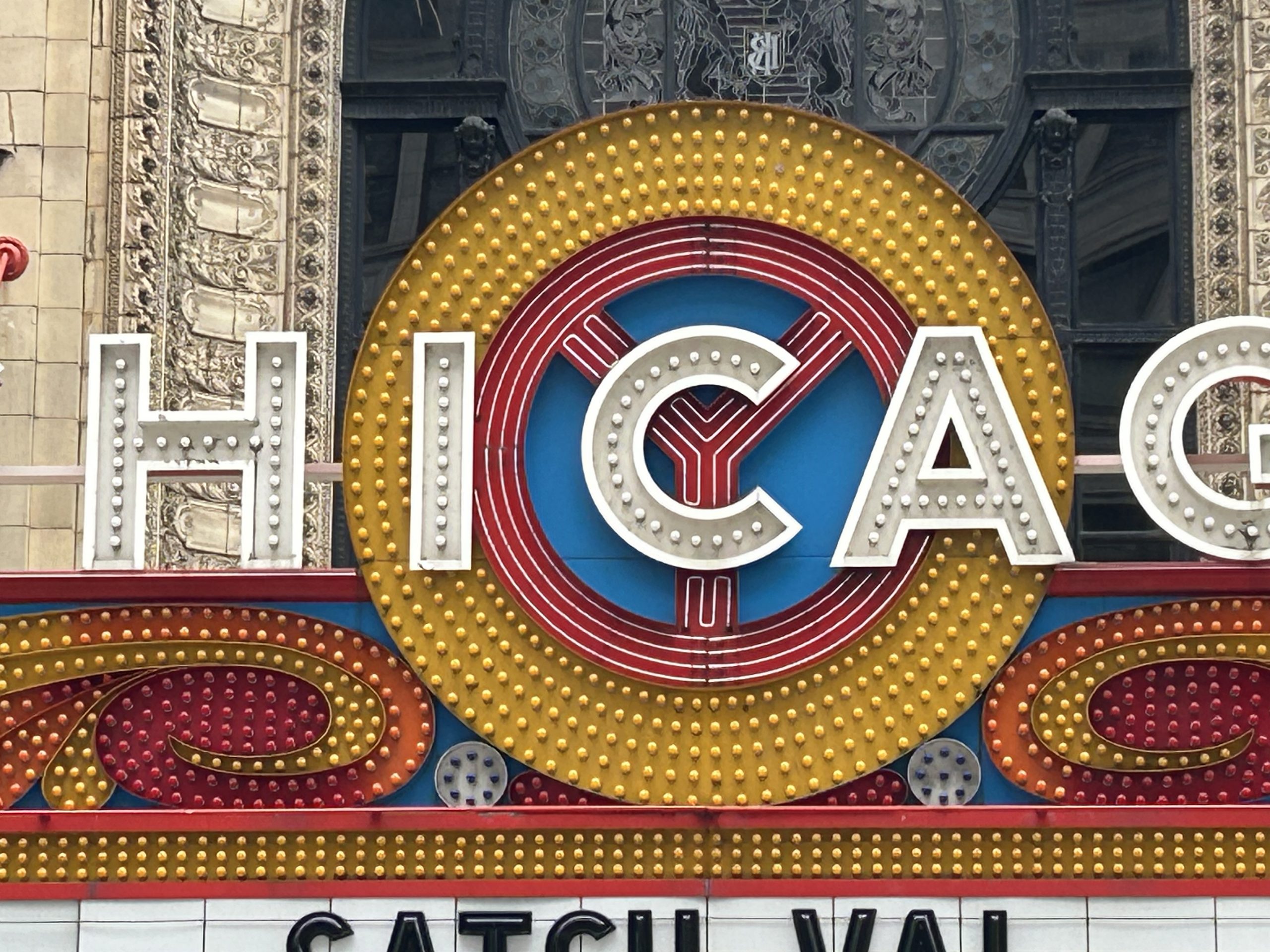
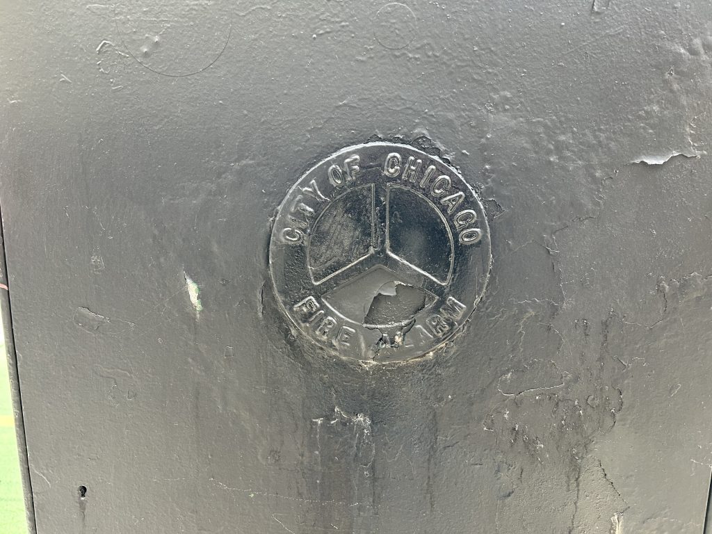
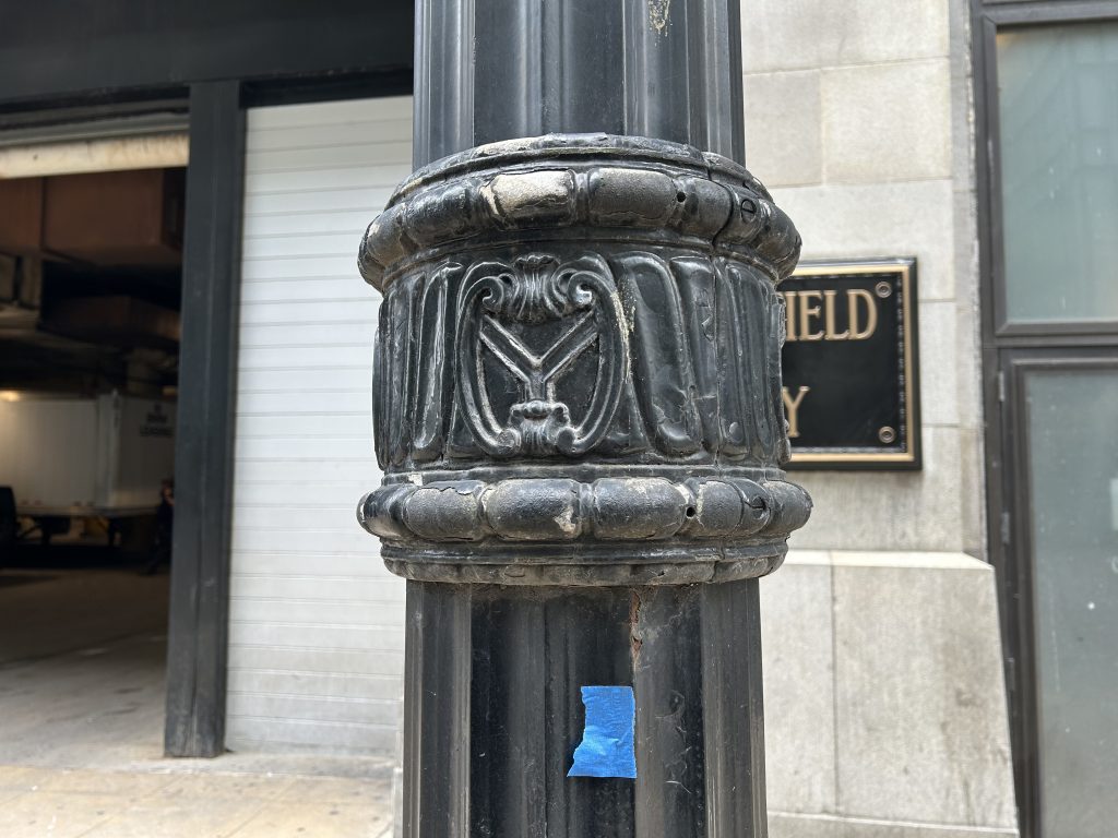
Over the years, the municipal device has been incorporated throughout Chicago. Its most prominent placement is front-and-center on the famous marquee of the Chicago Theatre, but it can also be found on public buildings, the logos for city agencies, bridges, utility boxes, the Grand Ballroom at Navy Pier, and even lampposts.

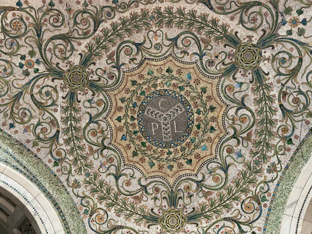
Arguably, the most beautiful take was created in 1897, only a few years after Roewald proposed it—the Tiffany-built mosaic in the Chicago Cultural Center’s Preston Bradley Hall, where it formed the logo of the Chicago Public Library, the building’s original use. The ‘Y’ can also be seen in the hall’s northwest corner and on an arch just inside the Washington St. entrance, directly above the inlaid city seal.
As the four-star flag gained traction, the municipal device fell out of favor. It’s also been speculated that, when upside-down—a possible nod to the river’s reversal—its similarity to the peace symbol negatively impacted its popularity in the 1960s.
However, the 21st century has seen a revival of the ‘Y’ as a way of drawing a through-line between the city’s past and present. It can be spotted in two places in Millennium Park—Wrigley Square and the lampposts at the skating rink. The Chicago Cubs’ City Connect jersey, which they wear during Friday home games, incorporates the iconography of the municipal device and the flag on its sleeve. And, in 2022, Cook County unveiled its new flag, which features a light blue ‘Y’, re-emphasizing Roewald’s intention of showing the importance of the Chicago River to the region.
Now, when you walk through Chicago and see the 25th letter of the alphabet by itself, you won’t have to ask ‘Y’.

The Adventure starts when you say it does.
All eATLAS Adventures are designed and built by experienced eATLAS Whoa!Guides. They're always on. Always entertaining. And always ready to go.
Check out our Adventures!